
How Big Pharma Rigs Clinical Trials—And Gets Away With It
The game doesn’t start when the data is published. It starts with a handful of choices that can change the outcome before the trial even begins.


The following information is based on a report originally published by A Midwestern Doctor. Key details have been streamlined and editorialized for clarity and impact. Read the original report here.
In 2016, Del Bigtree convinced a top infectious disease doctor to do something public health has avoided for decades: conduct a study comparing the health outcomes of vaxxed vs. unvaxxed children.
Dr. Marcus Zervos vowed to publish the results no matter what.
The results were devastating for the vaccinated, and Dr. Zervos ultimately chose not to publish the study.
When confronted about it, he said bluntly: “Publishing something like that, I might as well retire. I’d be finished.”
Here’s what the study revealed:
• Vaccinated children were 4.29 times more likely to have asthma.
• Three times higher risk for atopic diseases (like eczema).
• Nearly six times higher risk for autoimmune disorders, a category that includes more than 80 different diseases.
• 5.5 times higher risk for neurodevelopmental disorders.
• 2.9 times more motor disabilities.
• 4.5 times more speech disorders.
• Three times more developmental delays.
• Six times more acute and chronic ear infections.
• Among nearly 2,000 unvaccinated children, there were zero cases of ADHD, diabetes, behavioral problems, learning disabilities, intellectual disabilities, tics, or other psychological disorders.
The study’s conclusion was equally striking. It states: “[I]n contrast to our expectations, we found that exposure to vaccination was independently associated with an overall 2.5-fold INCREASE in the likelihood of developing a chronic health condition when compared to children unexposed to vaccination.”
When science uncovers an inconvenient result, it often gets buried, or the data is twisted until it produces the outcome “The Science” wants.
How do you think Vioxx, a migraine and arthritis pain drug, made it to market?
An estimated 100,000 people died before the manufacturer (Merck) finally decided it was too dangerous to keep prescribing.
And Vioxx wasn’t an isolated case.
Roughly 1 in 3 drugs approved by the FDA get pulled or receive a major safety warning LONG AFTER they get prescribed to millions of people.
If Vioxx could be approved without the danger being flagged during trials, what else is on the market today that people assume is safe?
Perhaps the most important question is: how do they get away with rigging these trials in the first place?
The medical establishment built its reputation on one phrase: the gold standard.
Randomized controlled trials were sold as the cleanest way to separate real medicine from wishful thinking.
But once a trial costs tens of millions of dollars, the question changes.
Who can afford to define what everyone thinks is the “truth”?

This information comes from the work of medical researcher A Midwestern Doctor. For all the sources and details, read the full report below.
How They Rig Clinical Trials and The Price We All Pay For It

Randomized controlled trials (RCTs) can indeed be extremely useful.
They can detect small effects that individual doctors would never notice, like a slight increase in heart attacks or a modest reduction in symptoms across thousands of patients.
Clearly that has real value.
The problem begins when RCTs become the only evidence medicine is allowed to recognize.
Because once that happens, medicine stops asking a simple and important question: What actually helps patients?
Instead, it starts asking what can be patented, standardized, funded, pushed through regulators, published in major journals, and written into treatment guidelines?
That shift changes everything.
Large RCTs typically cost tens of millions of dollars.
That means most low-cost, off-patent, individualized, or practitioner-dependent therapies will never get tested at the scale regulators demand.
Not because they don’t work.
Because no one can make enough money proving they do.
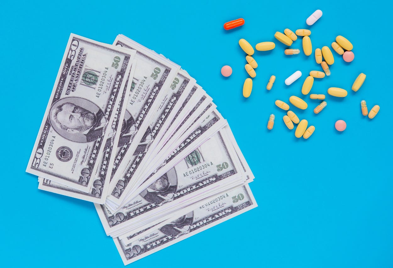
This creates a monopoly over medical truth.
Pharma can afford the trials.
Pharma can design the trials.
Pharma can analyze the trials.
Pharma can publish the trials.
Then doctors are told that anything outside that pipeline lacks “evidence.”
And that’s exactly where the gold standard starts to look less like science and more like gatekeeping.

The full article from A Midwestern Doctor shows just how clinical trials can be tilted before the first patient is even treated, then spun after the data is collected.
How They Rig Clinical Trials and The Price We All Pay For It
COVID made this problem impossible to ignore.
Early treatment should have been the central priority.
Instead, patients were told to take a painkiller like Tylenol or ibuprofen and return to the hospital if they felt worse and could not breathe.
That was not a serious outpatient strategy.
There is no way to twist it that makes this common strategy make sense.

A synthesis of COVID treatment studies showed something remarkable.
There was no clear relationship between how effective a treatment appeared and whether it landed in official guidelines.
Low-cost options clustered near the top.
Expensive, patent-protected options often landed far lower.
The guideline pattern looked more economic than clinical.
Ivermectin was listed with a 62% improvement at roughly $1.
Paxlovid showed 28% improvement at $529.
Remdesivir showed 10% improvement at $3,120.
Acetaminophen was listed at negative 28%.
The point is not that one chart settles every question. It’s that it exposes the pattern medicine refuses to confront.

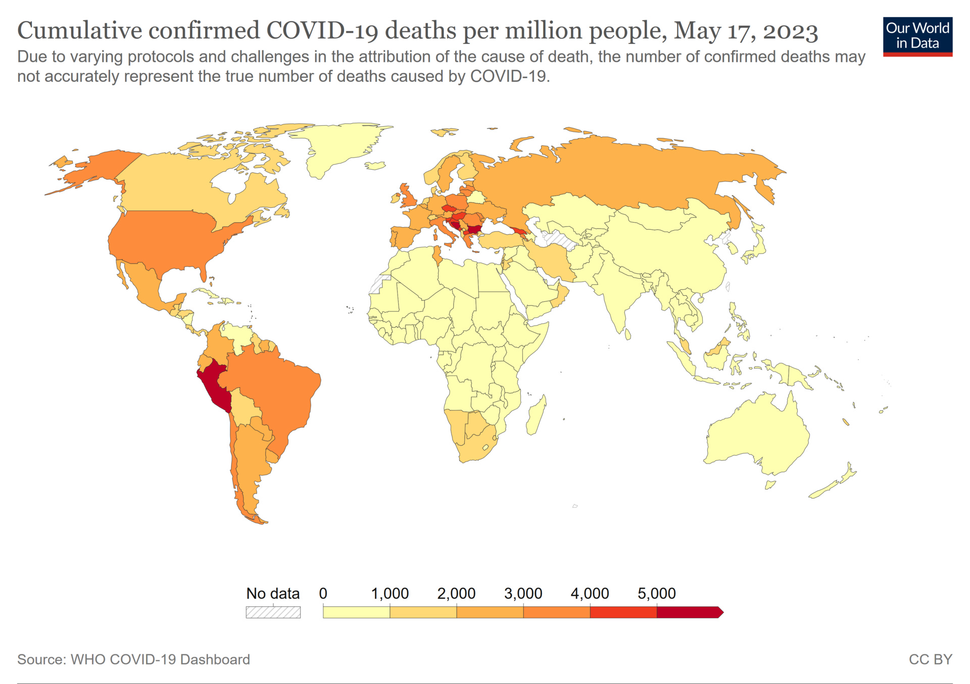
By May 2023, confirmed COVID death data showed the United States at 3,625 deaths per million.
Many African countries were reported between 10 and 20 per million.
Yes, there are differences in demographics, reporting, and health systems.
But after $5 trillion in direct appropriations, lockdowns, mandates, and “the science,” America should not have produced one of the worst outcomes in the world.
At the trial level, manipulation often begins with the comparator.
A new drug can be tested against placebo instead of the best existing treatment.
The comparator can be underdosed, overdosed, poorly administered, or chosen because it is outdated.
Then the new drug wins a fight that was never fair.
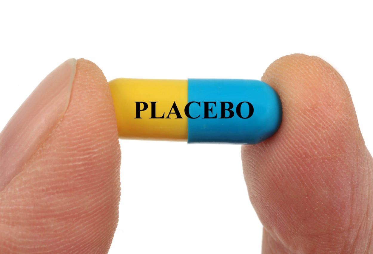
Then comes the bigger “placebo” problem.
In vaccine trials, the placebo is often not inert saline.
It can be another vaccine or an aluminum adjuvant!
That matters because if the control group also experiences side effects, the trial can make the new product look safer by equalizing harm across both groups.
And that’s how a safety signal gets buried. By design.
Trials can also cherry-pick participants.
Patients likely to suffer side effects can be excluded.
Patients most likely to respond can be selected.
Run-in periods can remove people who react poorly before randomization even begins.
By the time the official trial starts, the real-world patient population is already gone.

One of the most important sections of A Midwestern Doctor’s article explains why a trial can be technically randomized and still built to miss the injuries patients later report.
How They Rig Clinical Trials and The Price We All Pay For It
Surrogate endpoints are another trick.
Instead of measuring what people actually care about—like survival, disability, long-term function, or quality of life—trials measure easier markers.
Cholesterol
Tumor size
Antibody response
A symptom scale
A drug can win on paper while patients see little meaningful benefit in real life, when it actually matters.

Some of the most consequential manipulation happens midstream.
Trials can be stopped early when interim results look favorable.
Safety observation can be shortened before long-term harms appear.
The Pfizer COVID vaccine publication relied on roughly two months of post-dose safety data from a trial designed for two-year follow-up!
Then placebo recipients were vaccinated after authorization, wiping out the long-term blinded comparison.

Blinding can also fail.
If a drug has obvious side effects, patients and investigators may be able to guess who received it.
That can change behavior, reporting, testing, and adjudication.
In the COVID vaccine trials, an FDA review acknowledged that 477 participants with COVID-like symptoms were never swabbed.
That matters when the headline claim depends on counting cases.

Then comes the oldest statistical trick in medicine: Relative risk.
If a treatment reduces risk from 2 in 100,000 to 1 in 100,000, the absolute reduction is tiny.
But the relative reduction is 50%. That’s how small benefits become massive headlines.
In Pfizer’s trial, vaccinating 119 people to prevent one non-severe COVID case became “95% effective.”

Outcome switching is even more direct.
One review found 63% of published trials altered at least one primary outcome from the protocol.
33% introduced an entirely new one.
None acknowledged the change.
When the original target fails, researchers can search the data for something else that looks positive, then present that as the story.

Subgroup fishing works the same way.
If the main result fails, slice the data into smaller groups and analyze it different ways until something crosses p<0.05.
The STAR*D depression mega-trial claimed a 67% cumulative remission rate.
When judged by sustained remission, the actual rate was approximately 3%.
That’s not a small difference. That’s a completely different reality.

The most disturbing part is not that data can be spun. It’s that many of the people expected to police the spin are financially tied to the system. A Midwestern Doctor has all of the details in the full article.
How They Rig Clinical Trials and The Price We All Pay For It
Publication control turns weak evidence into consensus.
Negative trials can be buried.
Positive trials can be published multiple times.
An FDA analysis of antidepressants found the published effect size was 32% larger than what all submitted trials showed.
One olanzapine trial was reportedly published 143 times.
A bad signal can disappear. A favorable signal can echo through the literature for years.

Adverse events can also be renamed until they no longer look like drug harms.
Eli Lilly recoded suicide attempts on Prozac as “overdose” and suicidal ideation as “depression.”
Akathisia can be reframed as “agitation” or “anxiety.”
Companies claimed SSRIs caused sexual disturbances in only 5% of patients. An independent study found 59%.
That is how patients get gaslit.
The regulators are not clean referees standing outside the system.
Industry user fees now account for roughly 51% of the FDA’s total budget.
Pharmaceutical user fees fund 77% of the prescription drug review program.
Nine of the FDA’s last ten commissioners went on to work for or sit on the board of a pharmaceutical company.
And FOIA litigation revealed over $2.685 billion in royalty payments from pharma companies to NIH institutes and scientists between 2010 and 2023.
How are we supposed to “trust the science” when it is so clearly bought and paid for?

For now, the answer isn’t to throw away RCTs all together. It’s to stop treating them like a priesthood.
Medicine needs transparent data, replicated observational evidence, open patient-level review, and a system that rewards discovering what helps patients instead of protecting what makes money.
Science only works when it can be challenged.
When the data is hidden, the trial is curated, the harms are renamed, and the guideline committee is conflicted, “evidence-based medicine” becomes something much darker: A marketing department with a lab coat.

Thanks for reading! This information was based on a report originally published by A Midwestern Doctor. Key details were streamlined and editorialized for clarity and impact. Read the original report here.
How They Rig Clinical Trials and The Price We All Pay For It
For a deeper dive into what modern medicine has overlooked—or intentionally buried—check out these other eye-opening reports by A Midwestern Doctor:
The FDA’s 50-Year War on the Safest Painkiller Ever Discovered
What Happens When Humans Disconnect From Natural Light?
What’s The Healthiest Water To Drink?

While you’re at it, give A Midwestern Doctor a follow. No one brings more research, clinical insight, or historical context when it comes to exposing the health myths we’ve all been fed. This is easily one of the most valuable accounts you’ll ever follow.
If you haven’t subscribed to this Substack yet, take a moment to read what some of the most powerful voices in the medical freedom/truth movement have to say:
“The Vigilant Fox has been putting in a lot of work to create a news platform that shares the stories we want to hear about and brings attention to the most important things to know about. If you want a daily newsfeed in alignment with our ...”
– A Midwestern Doctor, The Forgotten Side of Medicine
“The Vigilant Fox absolutely is on top of things. We must support our fighters, and the Fox is fighting with truth.”
– Tom Renz, Tom Renz’s Newsletter
“Excellent capture of key video presentations on evolving pandemic science.”
– Peter A. McCullough, MD, MPH, FOCAL POINTS (Courageous Discourse)

The color graphic for Covid deaths is misleading. Here is what I noted in my article.
'Note: The color chart above is misleading because it fails to show the huge discrepancies between Sub Sahara Africa and the rest of the world. For example, heavily vaccinated Australia and New Zealand have death rates of 963/884 per Million respectively (just into the Yellows) but when compared to Subsahara Africa, their death rates are still 2-8x higher than the African numbers. If death rates of 300/million and below were WHITE, this color would (ironically) be only found in Africa."
https://1yfgk.substack.com/p/africa-is-still-the-smoking-gun
"Science only works when it can be challenged." And yet, herein still squats the elephant in the room.
The falsification of a contagious, self-replicating, intracellular parasite is well established, as was the blatant political, grotesquely unethical, scientivism required to orchestrate the covid theatre. Provenance, contagion, replication competent, demonstrable disease ~ all falsified.
The legion (+1200) of AESIs (Pfizer 6mo report Feb 2021 Appendix 1) was an ploy used to assure non-generalisability associated with shots.
Yet people are still sleep walking their way into tyranny, unwilling to see or oblivious to the scale of the evil perpetrated.