CNBC Unveils Bland New Logo, Sparking Cracker Barrel Flashbacks
What is with this soulless trend?
This article originally appeared on m o d e r n i t y and was republished with permission.
Guest post by @ModernityNews
Another media outlet has embraced the sterile void, proving once again that they just can’t resist turning everything into a forgettable blob.
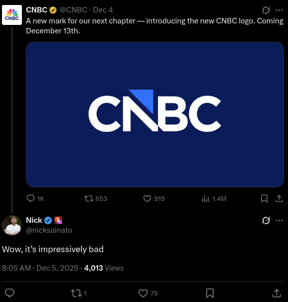
CNBC’s announcement of a new logo set to launch on December 13 has ignited backlash, with critics slamming it as yet another example of the bland, uninspiring redesigns plaguing modern brands.
The move drops the iconic NBC peacock after nearly 30 years, opting for a “cleaner, more modern look” that many see as a step toward corporate anonymity.
This push for clinical minimalism highlights a broader urge to strip away personality, making everything feel cold and detached.
It’s a trend that shows just how out of touch these decision-makers are, assuming sterile designs will resonate in a world craving authenticity.
#ad: Looking for high-purity DMSO you can actually trust?
Earth Harmony’s DMSO is USP Grade with 99.99% purity, non-diluted, with no added water, and stored in glass bottles to prevent plastic contamination.
NOTE: DMSO (Dimethyl Sulfoxide) is a powerful solvent. This product is for research and development purposes only. Only use as recommended by your healthcare provider.
Choose purity. Choose performance. Choose Earth Harmony DMSO.
DISCLOSURE: This post contains affiliate links. If you make a purchase through Earth Harmony, we may earn a small commission at no extra cost to you.
The new logo, described by CNBC as ‘pointing to the future while integrating current elements’, comes amid the network’s spin-off from NBCUniversal’s cable assets. According to reports, the update simplifies the design to keep the identity familiar but sheds the peacock feathers, aligning with the separation from its parent company.
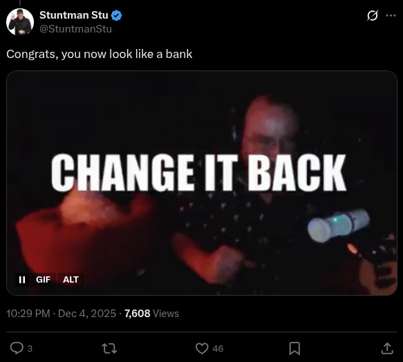
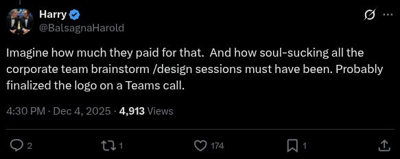
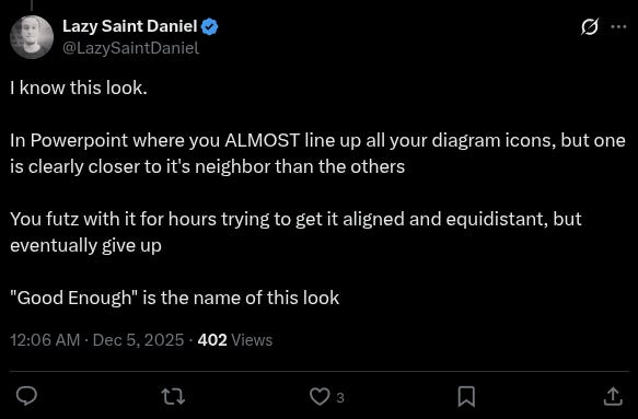
X users wasted no time ripping into the reveal, drawing immediate parallels to recent rebrand disasters.
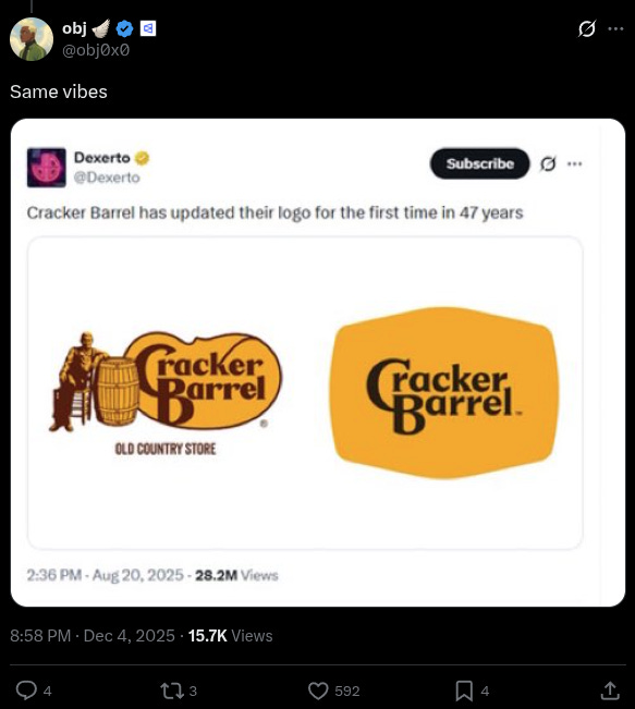
The CNBC fiasco instantly evoked memories of Cracker Barrel’s botched rebrand attempt earlier this year, where the Southern chain tried to ditch its rustic charm for a generic orange-and-brown logo and sanitized interiors. The overhaul, led by CEO Julie Felss Masino, sparked massive pushback from customers who cherished the folksy Americana vibe.
Cracker Barrel’s 93-year-old founder, Tommy Lowe, didn’t hold back in blasting the now-abandoned plan. “Oh, that’s crazy. That’s a bland nothing,” Lowe declared, calling it “pitiful.” He questioned whether Masino, with her background at Taco Bell, even understood the brand’s roots. “I don’t think so,” he said. “They’re trying to modernize to be like the competition – Cracker Barrel doesn’t have any competition.”
After spending hundreds of millions, Cracker Barrel reversed course amid the uproar, proving public resistance can force corporations to rethink their soulless agendas. Yet the trend persists, as also seen in MSNBC’s recent rebrand to “MS NOW,” which sounds like an awareness campaign for multiple sclerosis.
The MSNBC shift, part of its own cable spin-off, drew ridicule for its irony—watching the network allegedly leaves viewers with symptoms like fatigue and cognitive issues, much like the autoimmune disorder. One observer noted it could stand for “My Source for News, Opinion, and the World,” but skeptics suggested “MS OOO” or even a pile of excrement covered in whipped cream, emphasizing that no cosmetic change hides the underlying rot.
These rebrands underscore a deeper issue: an elite obsession with making everything as cold and clinical as possible, from architecture to media logos. Why the compulsion to erase warmth and character? It reflects a disconnect from everyday Americans who reject this sterile uniformity pushed by out-of-touch executives.
In CNBC’s case, the new design’s bank-like austerity fits the fake news media’s broader image—polished on the surface but lacking substance.
This pattern isn’t isolated. Corporations keep betting on minimalism, only to face backlash from those who value tradition over trendy blandness. It’s a reminder that when “modernization” is prioritised over authenticity, it completely alienates the very audiences they claim to serve.
Your support is crucial in helping us defeat mass censorship. Please consider donating via Locals or check out our unique merch. Follow us on X @ModernityNews.
Copyright 2025 m o d e r n i t y

